A micro bakery with a big attitude
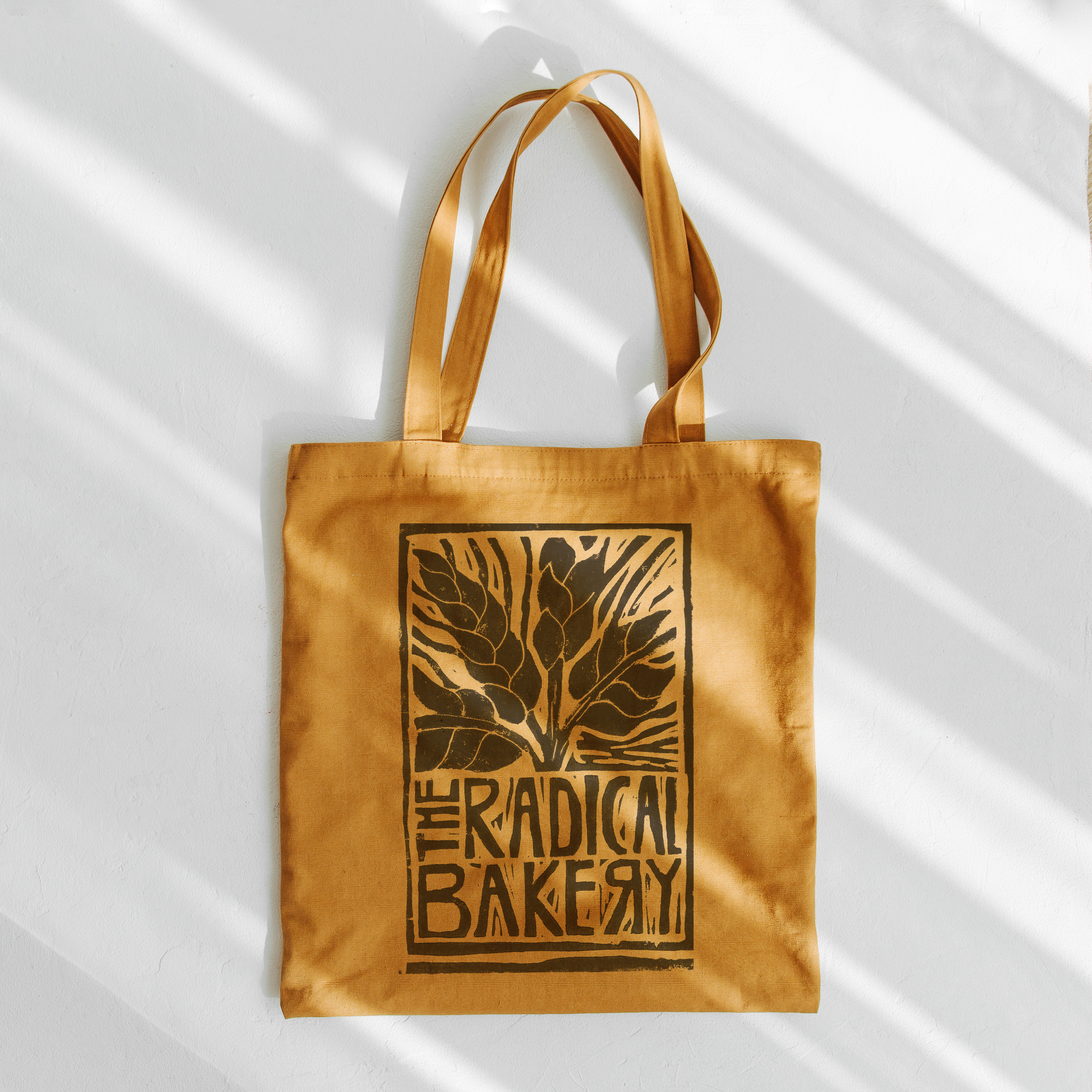
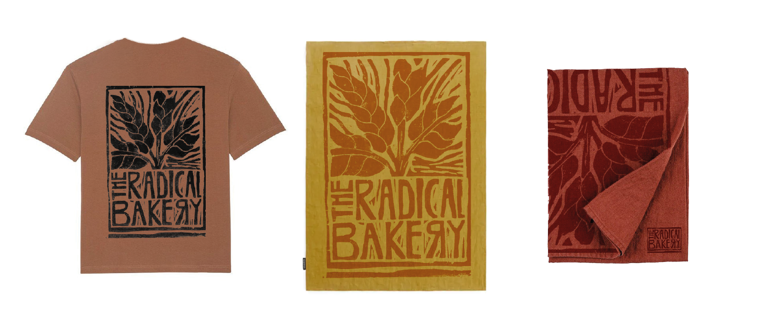
A tiny bakery with big views on how to change the relationship with soil, process and what we choose to eat. Going back to the roots and making the wheat a focus of the logo and reversing the “R” was a subtle nod to it’s radical ideas and ideas of change. The final logo is cut from Lino and block printed to give it a wholesome and authentic feel with earthy tones to reflect this too.
Scope of Work
Art Direction + Design
Hand cut Lino Logo and design
Copywriting
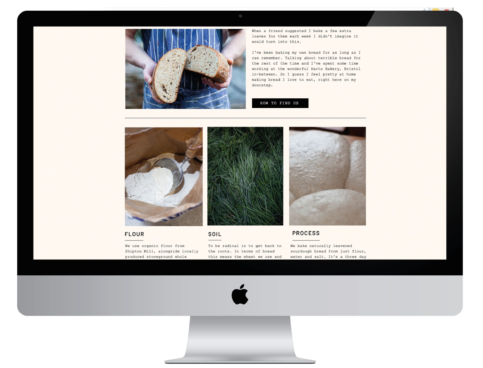
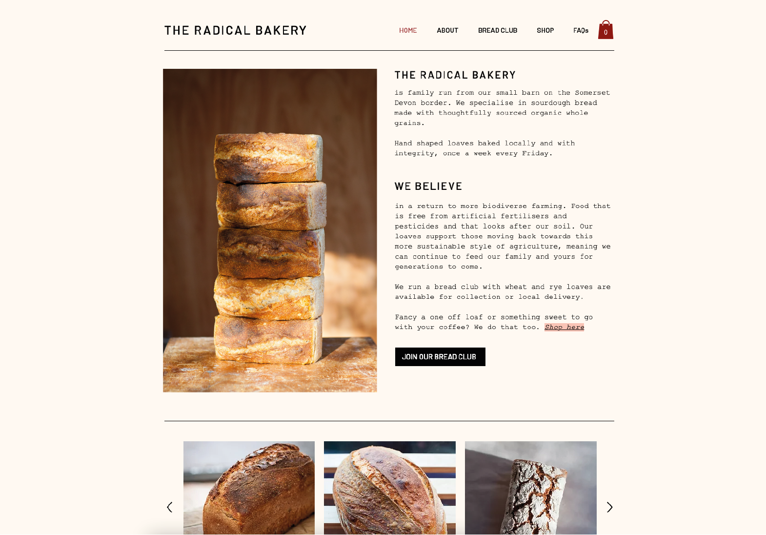
Website


